
Well-designed human-machine interfaces (HMI) reduce operator error, saving companies millions of dollars by reducing down-time and increasing worker safety. HTML5 programming enables the transfer of HMI designs to mobile devices, but programming is just the enabler. Let’s learn some best practices for HMI design elements that are specific to mobile devices due to size and interface considerations.
Blend In to Stand Out
A well-designed HMI reduces user error from misunderstandings or not having all relevant information available when they need to make critical decisions. The key to designing a successful HMI on a mobile interface is building one that is functional and, at the same time, delights the user. Most users are going to be running either Apple’s iOS or Google’s Android. Design your interface to blend in to the native platform that the user is comfortable with. Make heavy use of the native UI features for each platform wherever possible. This will make your life easier as the platforms evolve and the users update their operating system; ultimately making your users feel immediately at home when they open your application.
Navigation and Layout
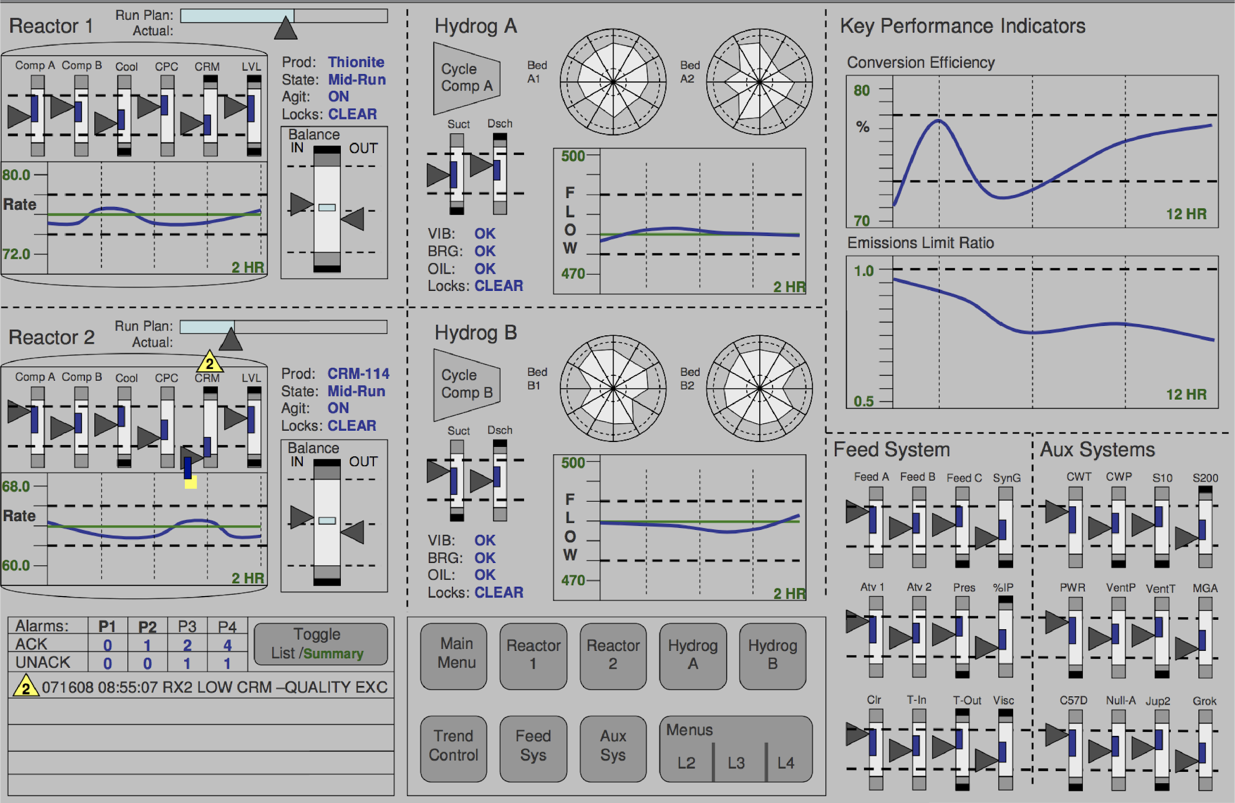
The users of your HMI will need to be able to do two things: view content and navigate to content they want to find. On a large screen HMI best practice is to minimize the number of physical screens to simplify navigation. An example of a well-designed HMI on a large screen might looks like this. The content is well organized and all of the summary information is immediately visible. Each of these views can be further expanded following a hierarchical navigation structure.
On a mobile device, however, having this amount of visual information on a single screen would be incredibly difficult for a user to interpret. Best practices instead are to prioritize user actions and the number of paths to reach the information they need vs minimizing the number of screens. Start by presenting a system level view which has the minimal level of information then provide navigation paths connecting different views for the users to follow. At each view, the content should fill the entire screen, while translucency and blurring can hint at more information. Avoid the use of bezels, gradients, and drop shadows as they introduce noise which takes the focus from the views content.
Navigation through your app should be intuitive and predictable. A good choice for a navigation pattern is a slide navigation drawer which displays many navigation targets at once, yet remains hidden until invoked by the user. This allows you use the entire screen for content while still maintaining a rich navigation model between parent, children and sibling views. This navigation model will also allow a user to quickly switch between unrelated views, while maintaining the ability present a deep hierarchical structure. It will also help your users learn about alternative views or features while building a mental model of how to interact with the system through your HMI.

Joseph D Zulick is a writer and editor at MRO Electric and Supply.
System Control and User Actions
An HMI designer must consider the developer model and the user model as they create and HMI to interact with the system. On a mobile device, we can state these more clearly as what visual controls are we presenting to a user and how are they going to interact with these controls. A general rule of thumb is whenever the number of possible actions exceeds the number of controls, you are likely going to confuse your users or obscure valuable features of your HMI. For example, you wouldn’t want to hide critical information behind a long press because the user may never find. Instead, you might add an info button in the top corner of the screen as an overlay. This design will subtly guide the user to discover the information without being intrusive or vague.
A number of control models have been developed for mobile interfaces to help minimize confusion for the user. Some common control models are: when something can only be on or off use a Toggle Button. If the user can only select one option, but this option has a range of possible values, such as screen brightness, use a slider. If the user can only select one option with a range of values, but they need fine control use a stepper button. If a user needs to select one of many categorical values use dropdowns or scroll wheels. As a last resort use text entry, as that is the slowest and most error prone way to interact with a mobile device. You can also combine tactile feedback through a vibration or sound with any of these control functions, however tactile feedback should be used carefully and only to bring visibility to interactions where visual cues are not enough.
You should design your controls with the thought that if that an error is possible, someone will make it. Therefore, design to minimize the chance of the error in the first place, or its effect once it is made. Maintain enough spacing for controls so that the users are able easily access them without making unintended touches. Also, make use of full screen pop ups to confirm actions that can have effects that are difficult to reverse.
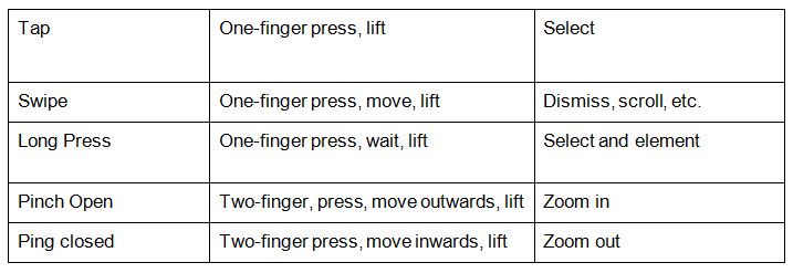
For mobile devices gestures, such as tapping and swiping, are the ideal paradigm for users to interact with your HMI. Reusing common gestures will ensure your app behaves in a predictable manner. Some common gestures that you should make use of when bring your HMI to a mobile screen are.
Design with Scale in Mind
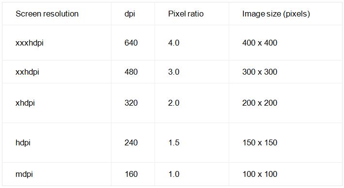
Traditionally, HMI have fixed screens and physical controls that you can design towards. When creating an HMIs for mobile devices you are no longer guaranteed a common screen resolution. As a result, UI elements (such as a button) appear physically larger on low-density screens and smaller on high-density screens. Because of this, you need to ensure that your visuals such as text, icons and graphical images are clear at every screen size you expect your users have. To help you create a HMI that can fit a variety of different resolutions, follow these ratios so that your images, controls and text will look the same when displayed across multiple screen sizes.
Wrap Up!
We have laid out some best practices for moving an HMI to a smaller screen. We have talked about how the basic rules of good design still hold; provide a good conceptual model and make things visible. However, there are certain unique challenges that must be designed around such as only being able to show limited visual information and a different user interaction paradigm.. What are some design rules that you have found useful when building HMI on mobile devices?
If you enjoyed this article and want to receive more valuable industry content like this, click here to sign up for our digital newsletters!


Leave a Reply